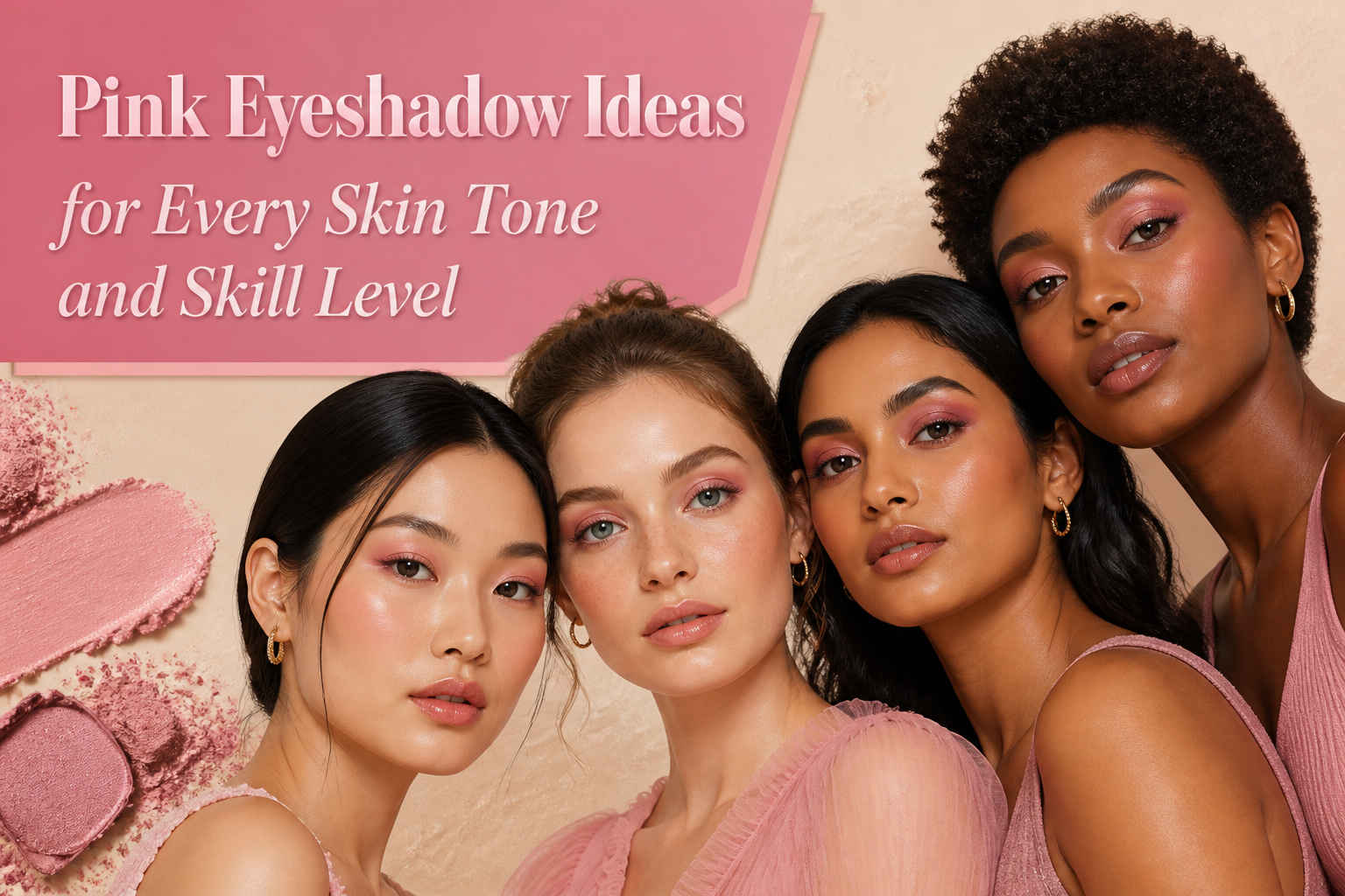
Pink eyeshadow works on every skin tone and skill level, but the shade that flatters depends entirely on undertone. Cool complexions need soft rose or mauve; warm ones turn sallow in anything without a peach or coral shift. The mistake most people make is stopping at color choice and skipping what sits underneath. A luminous base like L’Oréal Paris Lumi Glotion beneath a sheer wash keeps the glow coming from the skin itself, not floating on top like irritation. I learned that after three hours of looking like I had pinkeye at a wedding.
1. Glowy Skin and Rose Eyeshadow
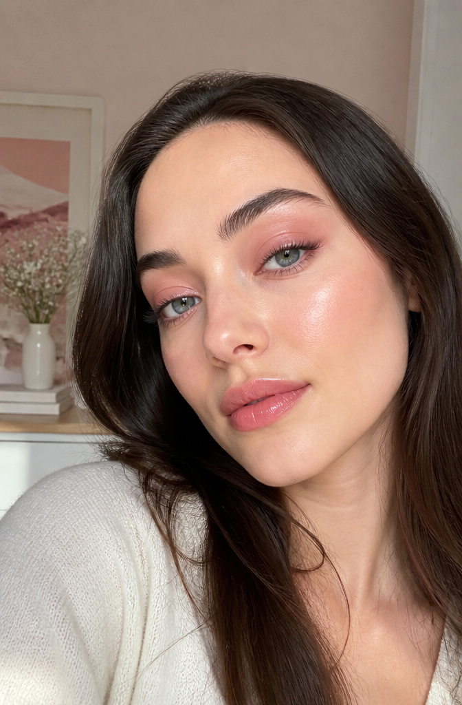
The difference between a rose shadow that looks lit-from-within and one that reads as a warning sign usually comes down to what sits underneath it. A sheer rose wash needs a luminous base to register as healthy rather than irritated. Layer L’Oréal Paris Lumi Glotion Natural Glow Enhancer beneath the color, and the skin itself carries the glow while the pink floats on top. I learned this the hard way after a matte pink made me look like I had pinkeye for three hours at a wedding. Cool undertones tend to favor soft pinks, rose, or mauve shades, while warm undertones lean toward peachy pinks or coral hues. Neutral undertones have more room to experiment. If the wash still feels too bare, add a black or brown liner to the upper lash line and define the lower waterline with a nude gel liner to open the eye without competing with the color.
2. Strawberry Girl Makeup
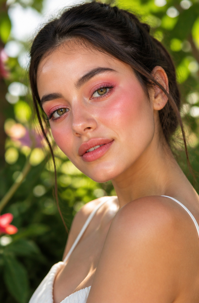
The strawberry girl makeup trend looked like filter bait when it first hit my feed, but the logic holds up in daylight: one warm red-pink tone across cheeks, nose, and lids reads as flushed health rather than costume. The danger zone is mixing a cool mauve shadow with a coral cheek stain. That combination sits on the skin like a sunburn you tried to cover.
I keep a cream blush in a true strawberry shade and use it on both zones, patting the same product across lids with a finger and blending the edges before it sets. The warmth ties everything together. Brown mascara keeps the definition soft without the hard stop of black liner, which would break the wash of color. On my skin, skipping powder altogether works better; the cream catches light the way actual flushed skin does.
3. Pink Inner Corners
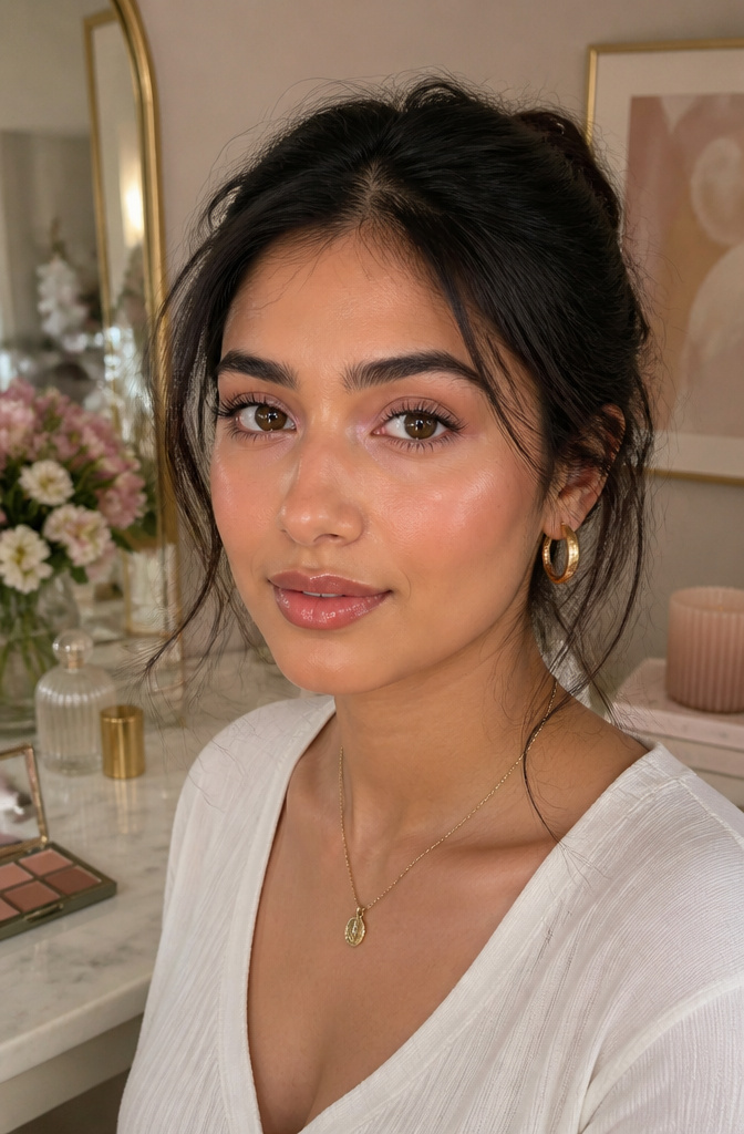
Pressing a pale pink shadow into the inner third of the lid, matte or shimmer, opens the eye without asking for a full lid of color. The rest stays neutral, maybe a soft brown swept through the crease and along the lower lash line, so the pink reads as a deliberate accent rather than a half-finished look. Shimmer formulas catch light here best, which is exactly what you want in a spot meant to brighten. On mornings when concealer has already done the heavy lifting and two minutes is all the budget allows, this is the move that still reads finished. A golden-pink metallic gives a softer glow, while a straight baby pink delivers more pop for the same amount of work. Either way, the commitment stays low and the payoff stays disproportionately high.
4. Shimmery Halo Eye
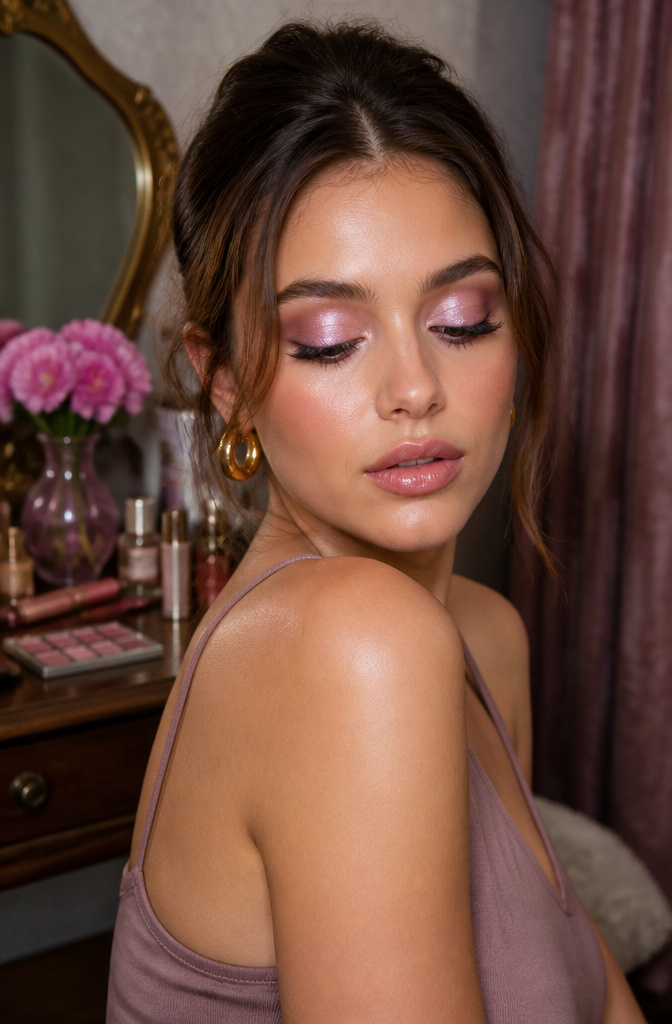
The halo shape follows the socket line, which means it works with deep-set, hooded, and protruding eyes without fighting their structure. A shadow brush that is too small leaves a hard edge where the dark and light tones meet, and that edge is what turns a dimensional glow into two pink stripes that do not belong together.
I spent months chasing this look and failing before noticing the tool was the problem. My narrow blending brush sat in the crease like a pencil line instead of feathering the border, so the center shimmer sat on top of separate blocks of mauve rather than rising from them. Switching to a fluffier, medium-density brush let the darker pink diffuse at the edges, creating the soft recession that makes the center light look like it is coming from inside the eye rather than sitting on top of it.
The sequence matters less than the pressure. Lay the deeper tone on the inner and outer thirds, keep the center bare, then tap the shimmer in place with a finger so it stays dense. Blend the seams last, with almost no product left on the brush, using small windshield-wiper strokes that cross the border between tones rather than pushing color deeper into either zone.
5. Pink Smokey Eye
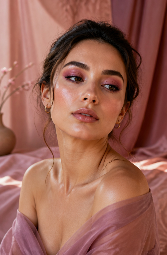
A traditional smokey eye built with mauve, rose, and burgundy instead of gray and black reads softer without losing depth. The structure stays the same: start the darkest shade right at the lash line and diffuse upward, letting the pigment fade rather than stopping it in a hard line. Pink keeps the whole thing from weighing down your face the way charcoal does.
I wore a version of this to a 6 PM dinner last spring and did not feel overdressed, which I cannot say for my charcoal attempt at the same event. The gradient matters more than the specific shades; a deeper burgundy at the outer corner blended into a mid-tone rose across the lid does the work of contouring without the harshness of black. For daytime, keep the darkest color to a thin band at the lashes and let the lighter pink take up most of the lid space.
6. Ombré Eyes
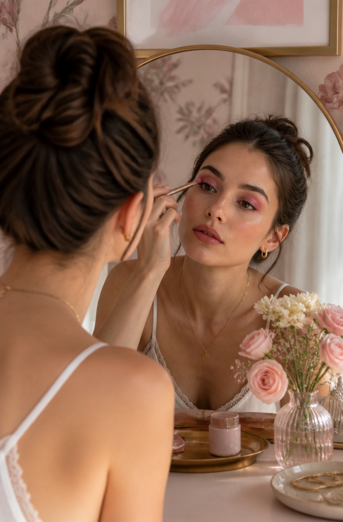
The first time I tried ombré eyes, the gradient disappeared the moment I opened them. Pale pink at the inner corner, medium rose across the center, deep mauve at the outer V: the colors read beautifully with my eye closed and vanished into a single muddy stripe with it open. Build higher than instinct suggests, carrying each shade above the natural crease so the transition stays visible at full lid.
Three similar undertones keep the blend clean; a neutral transition shade marked through the crease first gives the pink something to fade into rather than letting it sit stark against bare skin. Light to dark stays the rule, but the real work is in the altitude. Lightly blend the edges where the colors meet so no single line announces itself.
Mascara finishes it. The L’Oréal Paris Telescopic Instant Lift Washable Mascara, with its double-hook bristle brush, lengthens and separates enough to balance the drama above without competing for attention.
7. Pink Graphic Eyeliner
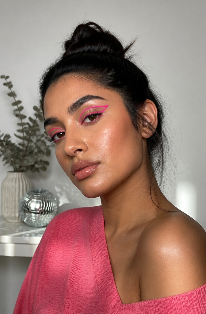
Graphic eyeliner lets you draw outside the usual wing. Floating crease lines, sharp geometric angles, doubled wings at the inner and outer corners, all of it reads louder in pink than it ever would in black. The DE’LANCI LA CATRINA 3 Color / Set Glitter Liquid Eyeliner gives the precision this needs, with a fine tip that deposits color without dragging.
My first attempt looked like a child’s drawing, all wobble and ambition. The fix was sketching the shape with pencil first, then laying the liquid on top. If you are nervous about a bold color, start the same way, or use a white liner to map the shape before you commit. Give yourself time, and if you mess up, wipe it off and start again. Makeup is supposed to be fun, and nobody gets a floating crease line right on the first pass.
8. Reverse Cat Eye
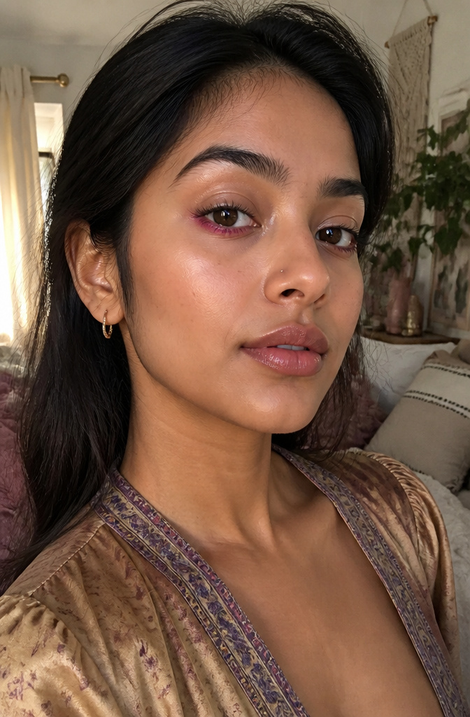
The reverse cat eye flips the wing to the lower lash line, drawn from the outer corner inward and smoked across the lower lid rather than flicked upward. Pink does the heavy lifting here, softening the severity that shape carries in black or brown. A sharp lower wing in dark color can read harsh or dated; the same structure in mauve or dusty rose looks deliberate but not severe.
The upper lid needs restraint to make this work. I keep it bare or barely tinted with a wash of bone or the palest shell pink. When both lids carry weight, they compete and the eye looks smaller, not larger. That bare space above is what lets the lower line read as a design choice rather than a mistake.
A small smudger brush and a gel-cream formula give the control this shape demands. Powder alone drifts; a cream pencil set with a matching shadow stays where you place it. The wing should point toward the tail of the brow, not the temple, or the angle throws the whole face off.
9. Rose Lids and Burgundy Mascara
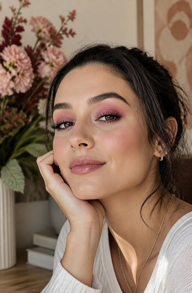
Warm rose across the lid reads softer than a true pink, and the real payoff comes when you swap the black mascara for burgundy or deep plum. Black would fight that warmth; the burgundy picks it up and keeps the whole eye in the same family. Burgundy mascara sounds like a statement until you wear it, then it just looks like better color coordination.
L’Oréal Paris Paradise Le Shadow Stick in Twinkly Rose works here as a one-and-done base, swept on and blended with a fingertip. I bought burgundy mascara on a whim about a year ago and now reach for it twice as often as my black tube. The L’Oréal Paris Voluminous Original Washable Bold Eye Mascara in Deep Burgundy is the one that matches this look if you are buying new.
10. Sunset Eyes
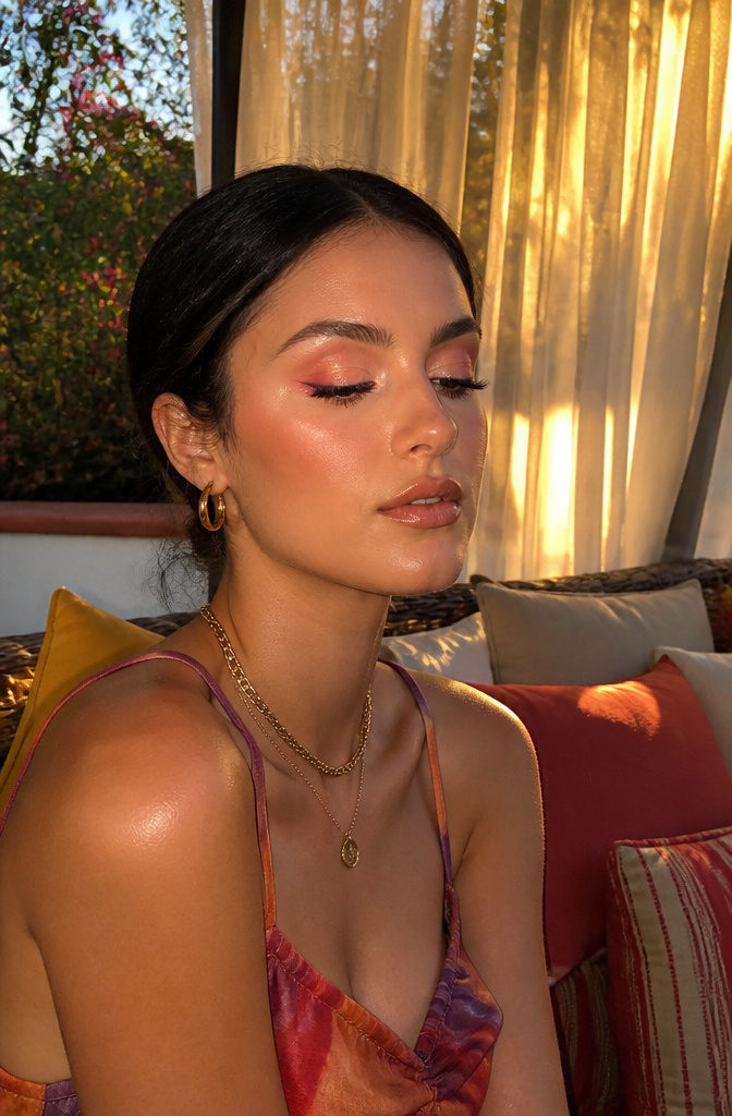
Late-day light does not arrive in blocks, and neither should your eyeshadow. Pink is the bridge that turns orange and gold into a single sky, rather than three stripes fighting across your lid. I lay a warm gold on the inner third of the eye, sweep pink through the center, and press a coral or warm orange at the outer edge. The work is all in the blending: small circles where gold meets pink, then pink meets orange, until the edges soften into each other. Without that step, the colors stay polite and separate, and the effect reads costume instead of sunset. A fluffy clean brush helps, or the same brush wiped on a tissue between colors. Skin tone shifts which warmth reads as light. On deeper complexions, a richer copper gold and a terracotta orange keep the glow from turning ashy. On fairer skin, peachy pinks and true yellow golds keep the look sunlit rather than sunburned. The first time I tried this, I stopped at two colors and wondered why it looked flat. The pink was the missing piece.
11. Bright Pink Waterline
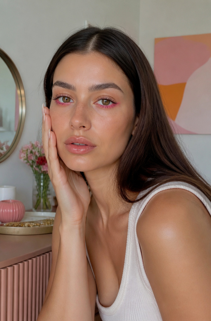
Matte hot pink or fuchsia drawn along the lower waterline reads as a deliberate jolt of color, not a mistake, provided the upper lid stays minimal or bare. The contrast pulls the whites of the eyes forward so the whole face looks more awake, like eight hours of sleep in a single stroke. What convinced me, reading through a dozen tutorials, is how many people skip the pigment question entirely. Sheer formulas disappear inside ten minutes and settle into a faint stain that looks accidental, not bold. A pencil with real pigment density is the only kind that earns its place here. The upper lid needs so little that a touch of concealer or a single neutral shadow is enough; anything more competes instead of frames.
12. Baby Pink Siren Eye
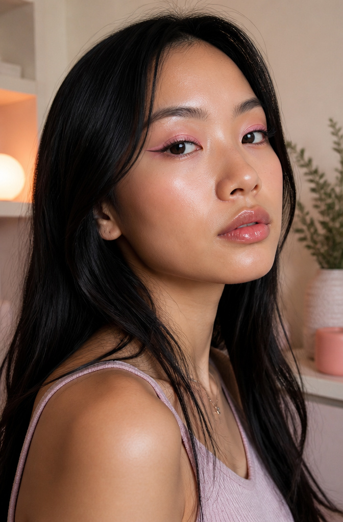
The siren eye usually shows up in smoldering brown or dense black, but swapping in a soft matte baby pink changes the whole conversation. The shape still pulls the eye outward and upward past the outer corner in that elongated flick, yet the color keeps the mood light, almost tentative. That tension between innocent tone and dramatic geometry is what makes the look interesting rather than sweet.
Powder alone will feather at the edge no matter how careful the brushwork. A flat concealer brush and a dot of creamy concealer sharpen the flick into something deliberate, almost vinyl-clean against the skin. The pink reads as a whisper while the silhouette still does the commanding.
13. Pastel Lids and Brown Mascara
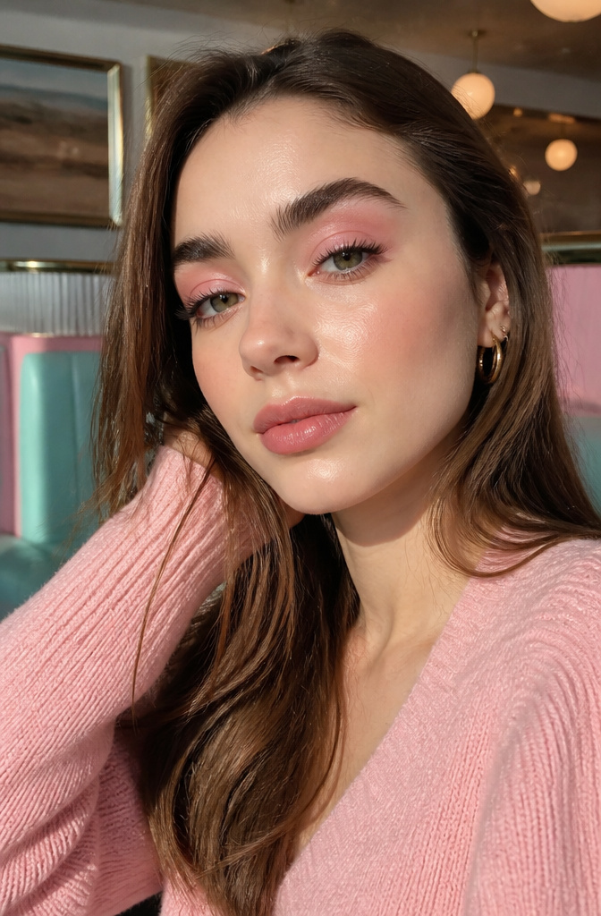
Cool pastel pink reads almost lavender on the lid, and pairing it with brown mascara keeps the definition gentle rather than dramatic. The combination feels slightly retro, like something from a 1970s beauty editorial, but the softness keeps it current.
Cream shadow is the base here, and set it with a matching powder or the crease collects in a line by noon. I learned that the hard way after three separate mornings of looking in a car mirror at lunch and finding a stripe where my lid folded. This is the one look where I will actually carry the powder for touch-ups, usually in a small travel jar tucked inside my bag. The brown mascara matters too: black would push the look into standard territory, but chocolate brown lets the pastel stay the story.
14. Pink Lashes
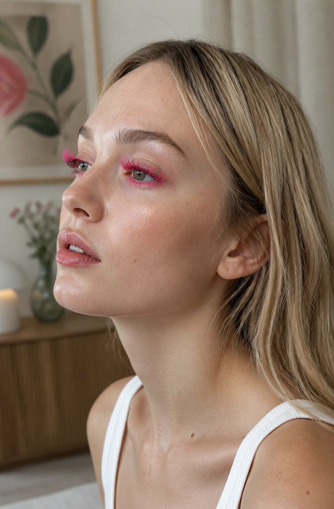
Colored mascara in pink reads editorial the second it leaves the tube, and it does not read natural. That is the point, but it is also the commitment. A drugstore formula I tried deposited more clump than pigment; the fibers stuck to themselves instead of coating the lash evenly. A dedicated lash tint or fiber formula handles the pigment load better, or you can build the effect yourself. Regular mascara first, then loose pink pigment dusted over with a clean spoolie, lets you control intensity and avoids the stuck-together look. The spoolie matters. A used one carries enough residual product to muddy the color or deposit flakes you did not plan on. Worn alone, pink lashes against bare skin is a full statement. Over a neutral eye, they become the single deliberate choice that shifts the whole face from polished to noticed. Either way, someone will ask what you did.
15. Pink Winged Eyeliner
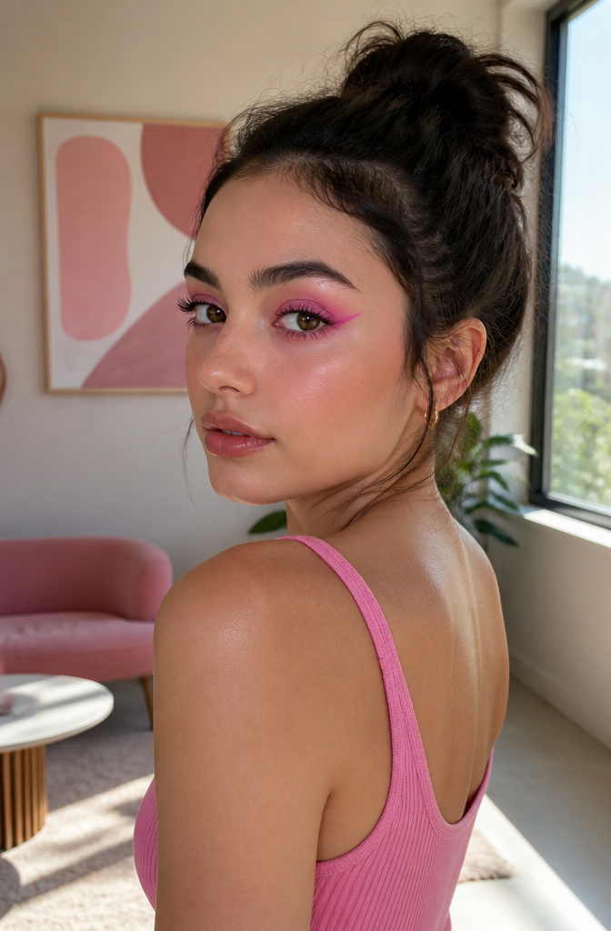
A pink wing drawn in liquid or gel liner reads as playful where black reads as severe, and that unexpected color is what saves the look when the line wobbles. A slightly uneven wing in hot pink pigment looks intentional, almost graphic, where the same flick in black would read as a mistake.
For something softer, the L’Oréal Paris Infallible Grip Mechanical Gel Eyeliner in Nude can be layered underneath a pink powder shadow. The nude base gives the powder something to grip without adding its own hard edge, so the final shape diffuses at the edges instead of looking stamped on.
My steady hand is worse than average, and this is still the winged look I actually finish rather than wipe off. The color does the work of making the shape look considered, which means a slightly wobbly line reads as artistic, not sloppy — the one time being imprecise works in your favor.
16. Monochrome Pink Makeup
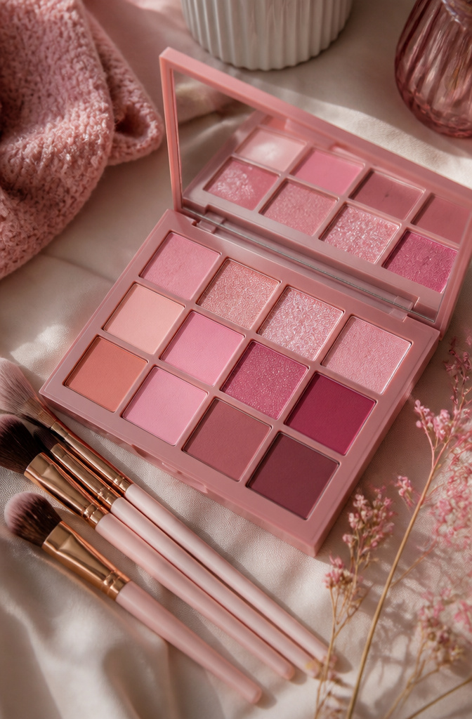
Running a single tone from lid to temple to lip sounds effortless until you catch your reflection under fluorescent light and every feature has melted into one pink plane. The sources keep calling monochrome pink a trend, but none of them linger on the one move that actually makes it wearable: varying the finish so each feature catches light differently.
Matte shadow on the eyes gives you a soft, velvety base that recedes slightly. A satin blush on the cheeks reads as skin rather than product, catching a gentle glow where bone meets light. A gloss with slight shimmer on the lips becomes the single reflective point, drawing the eye without shouting. Same hue, three behaviors.
The execution is simple once you commit to the texture rule. I pick my pink first, usually a mid-tone rose, then assign finishes before I touch a brush. Matte shadow stays below the crease and diffuses outward toward the temple, stopping just shy of where blush will sit. Satin blush starts at the apple and lifts along the cheekbone, never crossing into the eye space. The gloss stays central on the lip, no overlining, so the shimmer stays contained.
What flattens the look is matching finish to finish: shimmer on lid, shimmer on cheek, shimmer on lip, and suddenly you’re one dimensional pink disc. The L’Oréal Paris sources suggest connecting shadow to blush by blending outward until they nearly meet, which works only if the finishes differ enough to read as separate zones. Skip the texture variation and the connection reads as a mistake, not a choice.
17. Champagne Soft Glam
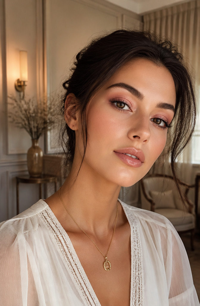
The pink that looks like a mistake on most people is usually the one that reads straight bubblegum or fuchsia against the skin. A beige-pink that shifts champagne in daylight solves the problem without canceling the warmth entirely. I blend it through the crease first, then wash whatever remains on the brush across the lid so the tone stays continuous rather than patchy. A slightly deeper mauve-pink pressed into the outer third gives the eye its shape back; without that step, the look can read flat, like concealer applied too widely. This is the combination I point friends toward when they say pink makes them look sick or tired. The neutral undertone absorbs the redness that cooler pinks pull out of the eye area, especially on fair or olive skin where that complaint comes up most. Skill level barely matters here. The colors are close enough in value that sloppy edges still look intentional, and since nothing is metallic or dark, there is no harsh line to rescue if the blend goes wrong.
18. Pink and Purple
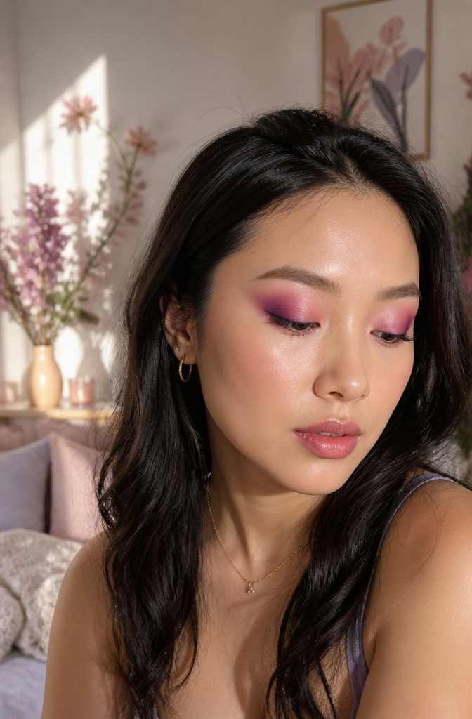
Pink and purple sit right next to each other on the color wheel, which means they blend together with far less fighting than pink and blue ever will. The usual approach is to lay the purple down first, working it into the crease and outer corner, then sweep pink across the lid and blend where the two meet until the boundary softens into mauve. The plum-leaning purples in the Huda Beauty Rose Quartz Palette keep this combination wearable rather than pushing it into costume territory; violet would read far more dramatic, but plum stays in the range of something you could wear to a 9 a.m. meeting without explanation. For a reversed take, purple on the inner half and pink on the outer works too, though that placement reads slightly more editorial and slightly less everyday.
Choosing the Right Pink for Your Skin Tone
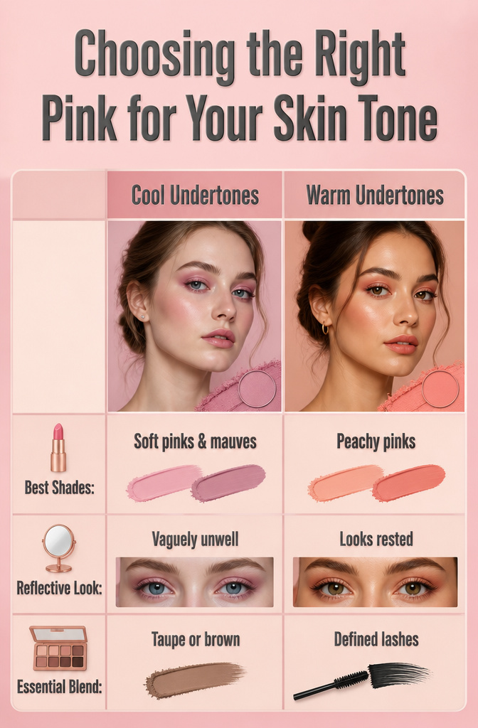
Soft pinks and mauves sit best on cool undertones, while warm undertones need peachy pinks to keep from looking sallow. Neutral undertones have the run of the spectrum, though in practice that freedom just means more swatching before you find the shade that actually wakes your face up.
I spent years in blue-based pinks, the kind that read bubblegum in the pan, and never understood why I looked vaguely unwell by noon. The switch to peach-rose changed everything; same eye color, same application, but suddenly the reflection looked rested. Warm undertones need that peach or coral shift to keep pink from pulling gray against the skin.
The safeguard that saves any of these choices is blending pink into neutral territory, taupe or brown in the crease or along the lash line, so the color never floats unanchored. Defined lashes with eyeliner or mascara finish the job, adding depth that keeps the look deliberate rather than accidental.
Blending Without Harsh Lines
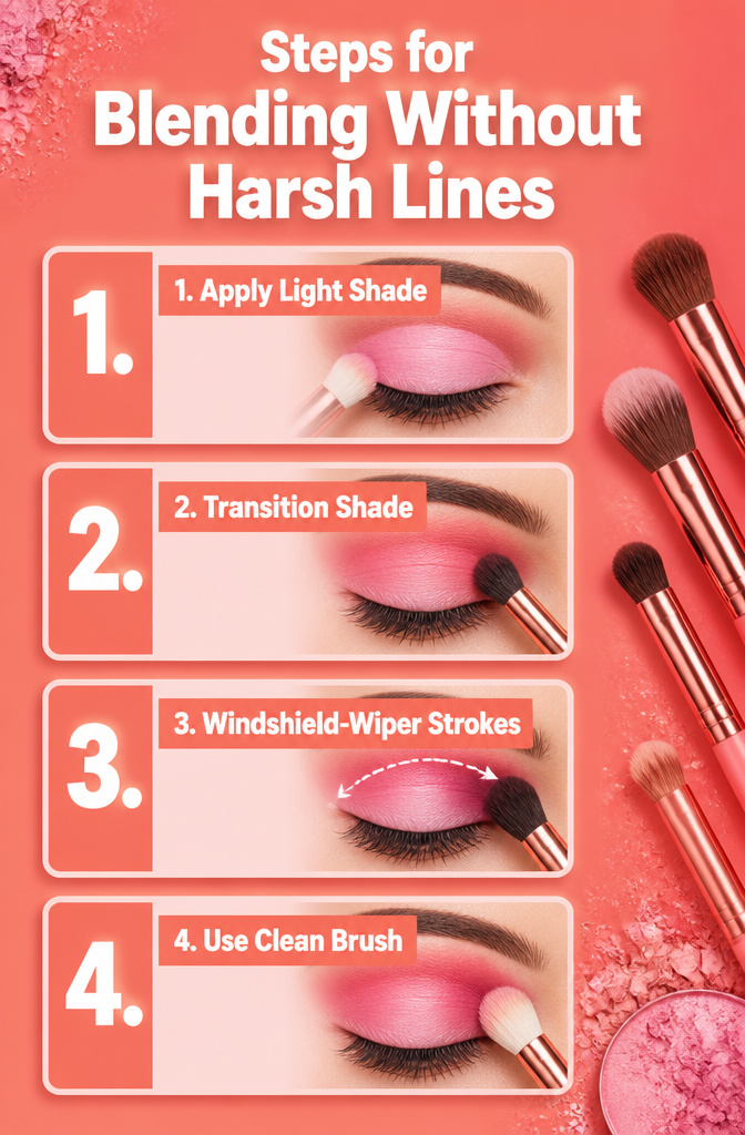
Blending separates a pink eyeshadow idea you can actually wear from one that stops at the bathroom mirror. The standard structure is lighter shade at the inner corner, darker at the outer, with a transition shade between any two colors that differ by more than one depth level. Skip that middle tone and the gradient turns muddy or patchy, especially with pinks where the undertones already fight each other.
Motion matters as much as placement. Windshield-wiper strokes back and forth through the crease deposit color without streaking, while small circles on the lid build the pigment where you want intensity. The edge is where most looks fall apart. A clean, fluffy brush with no product on it, kept just for softening boundaries, will diffuse the line where shadow meets skin better than adding more color to fix it. I learned this after watching a bright pink halo eye collapse into a single muddy band because I kept layering instead of stepping back with an empty brush.
Frequently Asked Questions
What lip color goes best with pink eyeshadow?
Match your pink eyeshadow with pink lips for a coordinated look, or choose a pinky-nude or rich berry for contrast. Cool skin tones pair well with shades like First Kiss or Miss Magenta, while warmer tones look best in coral, salmon, or cinnamon hues such as Tropical Coral or Rose Heat. The formula matters less than staying within the pink and red family, though varying finishes between eyes and lips keeps the look dimensional rather than flat.