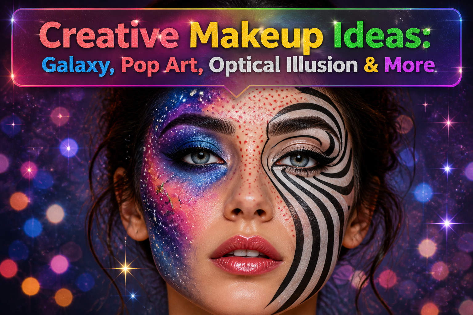
1. Galaxy Look
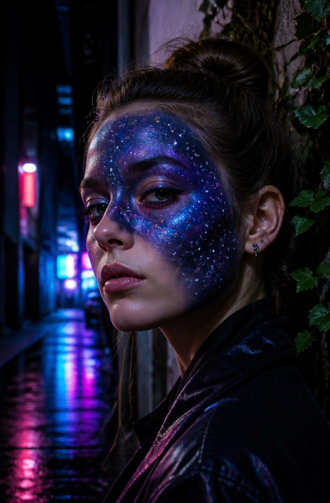
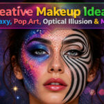
Blues, purples, and blacks sponge-blended across the face turn skin into something closer to nebula footage than cosmetics. The #100DaysofMakeup challenge pushed this galaxy look from costume territory into daily creative practice back in 2016, with artists posting orbital gradients and fine white star dots for months straight until the technique refined into something you could wear without a full production crew.
Swatch the colors on the back of your hand first to see how the pigments merge before they hit your face. Blues and purples from different brands can shift muddy or neon against each other in ways the pan does not predict, and discovering that after half your eye is painted wastes time and remover. A dab of glitter pressed over the finished blend reads as stardust without the full disco effect, though the balance between cosmic and craft-project is thinner than most tutorials admit.
2. Optical Illusion Makeup
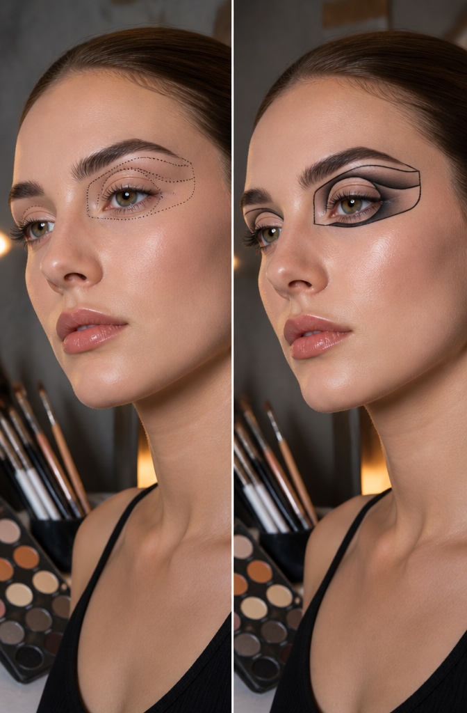
Optical illusion makeup turns your face into a visual puzzle that makes people look twice. The technique hinges on mapping shapes with dots before you draw any lines, a step that saves you from committing to crooked geometry. Artists like Mimi Choi build melting faces and split portraits this way, and the same dot-to-line approach works at home.
Shading creates the fake depth; line work locks the trick in place. When you connect those guide dots, one long stroke beats several short ones. The single motion keeps the line cleaner and steadier than tentative dabs that wobble at each restart. Patience matters more than a pro hand, since the design only reads once the shadows and edges line up precisely.
3. Animal-Inspired Designs
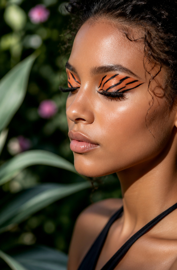
Tiger stripes across the temple or butterfly wings floating above the crease both read as costume from ten feet away, but the real work happens in the millimeters. Nail art brushes, the kind with a two-inch stem and a tip that comes to maybe six hairs, are what let you lay down the orange base and then pull black through it in one tapered stroke without the colors mudding together. The first time I tried a butterfly with a standard eyeliner brush, the wing veins looked like I had drawn them with a marker held in my fist. The nail set cost less than a single department-store liner and turned out to be the right tool for the job. Smaller motifs, like a single wing on each eyelid, build the hand control you need before you commit to a full face.
4. Pop Art Makeup
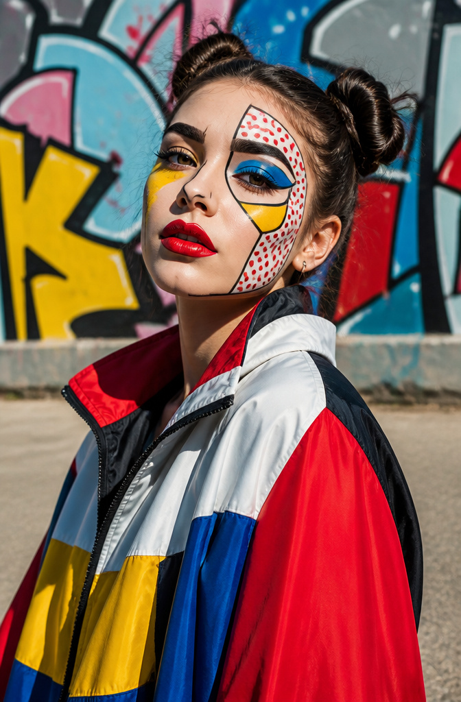
Pop art makeup borrows straight from the comic panel: flat blocks of color, thick black outlines, and the Ben-Day dots you see in old Sunday strips. The look went viral on social media for good reason. It reads instantly as art, not just decoration, and it photographs with almost unnatural clarity because the edges are so deliberate.
The colors that make it work are the primaries. Red, blue, and yellow in their most saturated, unmixed form. These are the same pigments that show up in every creative medium from screen printing to poster design, and for makeup they have a practical advantage too. A true primary red or cobalt blue reads as "intentional graphic" rather than "trying to match my outfit." That makes the look wearable even when the rest of your wardrobe is neutral.
Highly pigmented eyeliners and a steady hand are the non-negotiables here. The outline is what sells the cartoon effect; wobble kills it. I have watched enough tutorials to know the common failure point: people use their everyday black liner, which sheers out or skips, and the whole face collapses into smudge. Gel or liquid with real opacity, applied with a brush you can control, is the difference between Roy Lichtenstein and a coloring book.
5. Nature Elements
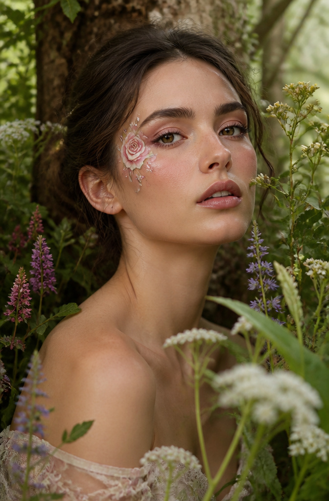
Small details carry the weight in nature-inspired work. A single rose painted at the temple, the kind of restrained gesture Tal Peleg built a reputation on, reads as intimate rather than costume. The shape matters more than botanical accuracy. Leaves work best when they follow the natural line of the brow bone or extend the wing of an eyeliner, letting the face’s geometry do half the composition.
Gems and pearls turn flat paint into something that moves with you. A rhinestone placed at the center of a painted flower catches light the pigment cannot, and the shift between matte petal and hard facet gives the design a reason to exist beyond the photograph. Pearls along a vine line do something similar, adding a slight weight that changes how the wearer holds her face. The rule I follow after watching this go wrong: one texture addition, not three. Rhinestones and pearls together fight each other; pick the one that answers the occasion and stop.
6. Cultural Heritage Makeup
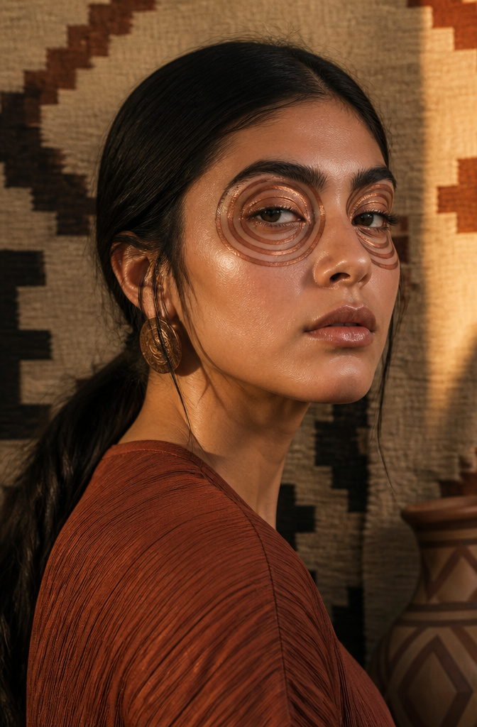
Traditional Aboriginal dot painting and tribal African patterns have been showing up on runways and editorial shoots for years, but the shift from runway to real life takes more than copying a motif onto your eyelid. The distinction that matters is adapting the geometry and rhythm of a pattern, not wearing someone else’s sacred symbol as a costume. A series of concentric circles, translated into a gradient of bronze and copper eyeshadow across the socket, reads as reference rather than appropriation because it keeps the visual logic without claiming the cultural weight.
Activist makeup artists have used this space deliberately. A 2019 campaign by a collective of Indigenous Australian women recreated dot-painting techniques in editorial work, with proceeds funding language-preservation programs, and the artists themselves controlled which patterns appeared and how they were described. The makeup was the fundraiser and the statement simultaneously.
For personal storytelling, the same principle holds. A client of a makeup artist whose work I follow wore adapted henna patterns from her grandmother’s wedding photos for her own ceremony, modernized into negative-space liner that framed the eye rather than covering the face. The pattern was recognizable to family, invisible as citation to strangers, and that was the point: the story traveled only as far as she chose to tell it.
7. Glow-in-the-Dark Makeup
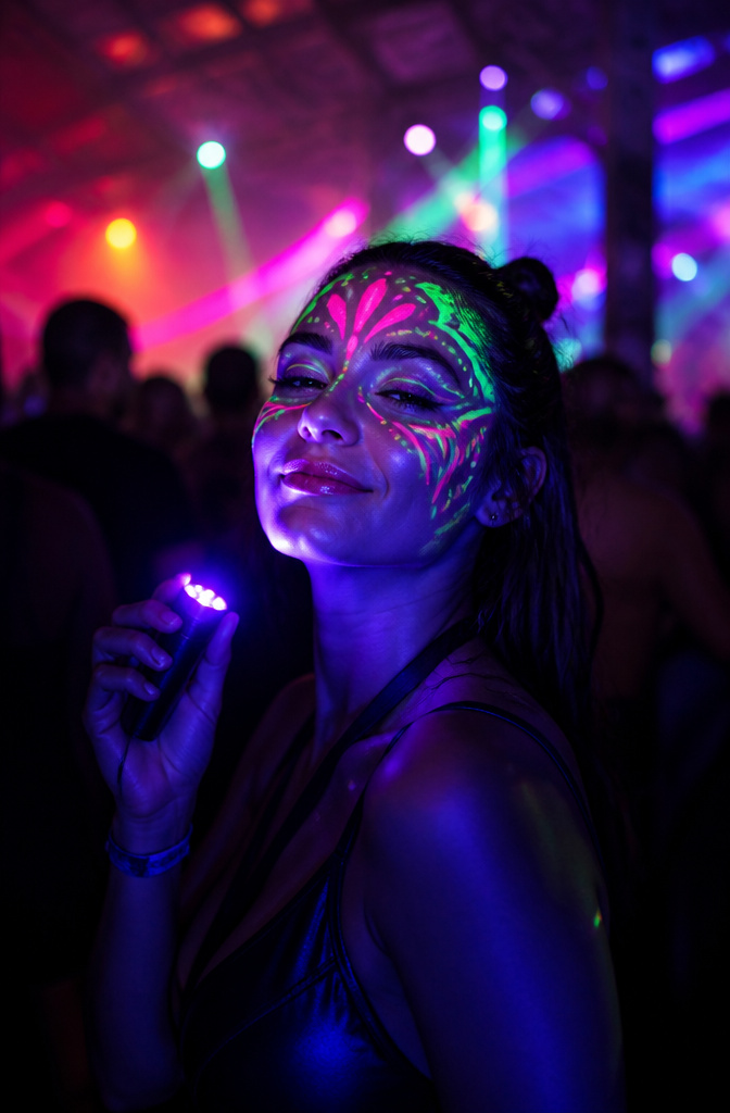
UV-reactive pigments turn ordinary foundation and liner into something that only reveals itself once the sun sets and the blacklights come on. Music festivals like Coachella have made this look unavoidable; walk through the crowd after dark and you’ll see neon stripes floating across cheekbones that looked completely natural an hour earlier.
The product type matters more than the technique. Standard "glow" makeup usually means reflective shimmer, which dies under blacklight. You need formulas explicitly labeled UV-reactive or blacklight-reactive; these contain optical brighteners that absorb invisible UV and emit visible color back. Layering neon shades, usually green over pink or electric orange at the temples, gives the strongest fluorescence because the pigments don’t muddy each other the way ordinary colors would under that weird purple club light.
Symmetry counts more here than in daylight makeup. Under blacklight, uneven liner doesn’t read as edgy; it reads as a mistake glowing two feet away from your face. A small brush and a mirror with built-in UV, or testing the look under a handheld blacklight bulb before you leave, catches the wobbles regular lighting hides.
8. Fantasy Characters
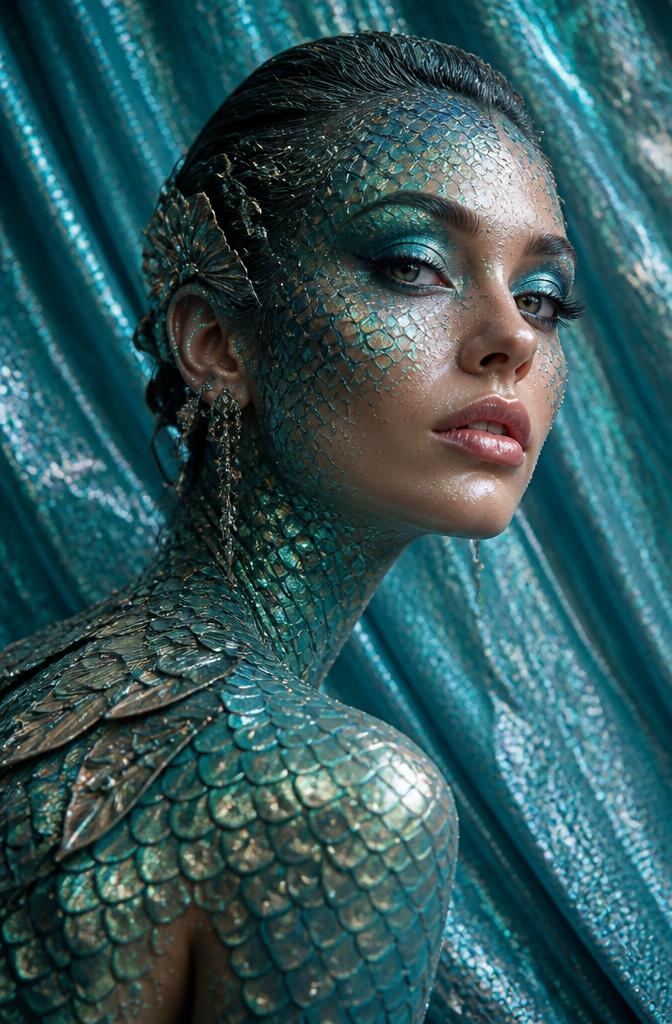
The first time I tried a mermaid scale pattern across my collarbone, the result looked more like fish gone wrong than fantasy glamour. Following tutorials from artists who actually work in film and theater changed everything. Their breakdowns of prosthetic application and where to place shimmery pigments so they catch real light, not just bathroom mirror light, made the difference between costume-party amateur and something that holds up at conversation distance.
Clever shading can stand in for latex when you are not ready to invest in a full special-effects kit. Strategic glitter placement along the high points of the face creates the same dimensional shift that prosthetics achieve through physical texture. The tutorials that helped me most spent as much time on removal and skin prep as on the look itself, which matters more than most beginners expect when you are layering pigment that thick.
9. Minimalist Abstract Art
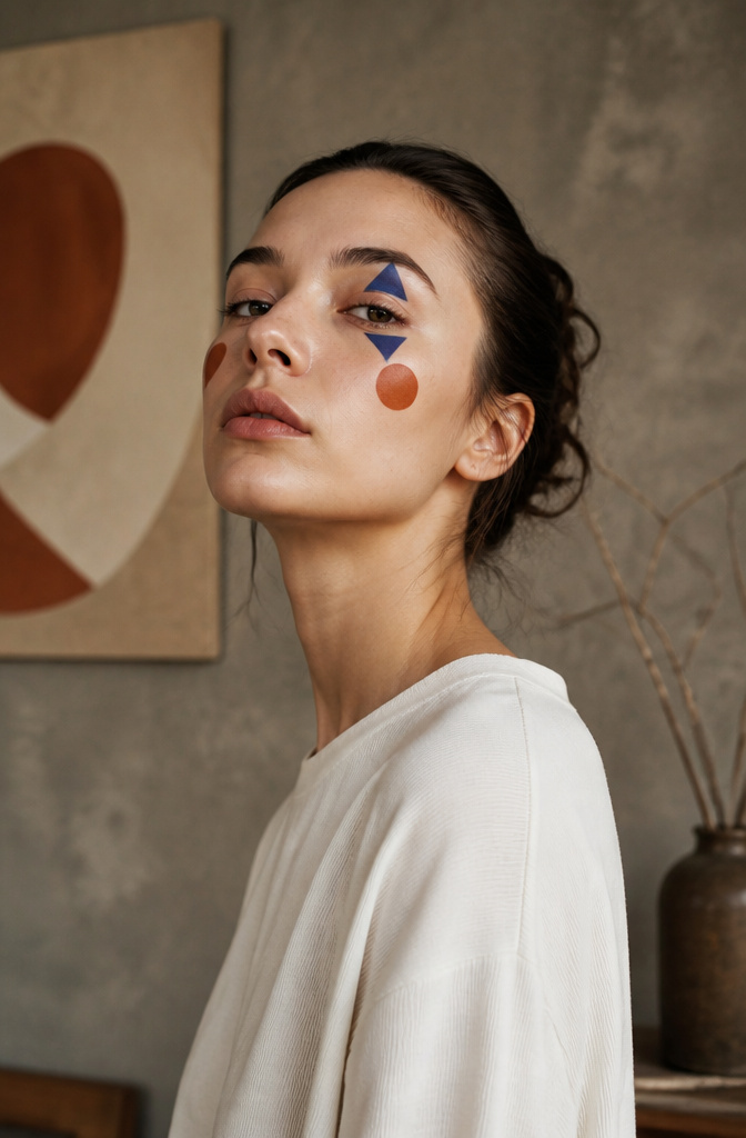
Sharp triangles, dots, or zigzag lines placed asymmetrically on the face make a statement without the hours of blending that complex looks demand. The shapes stay simple; the colors carry the weight. A single cobalt triangle at the outer corner of one eye, matched with a rust dot on the opposite cheekbone, reads as intentional rather than unfinished. Asymmetry is the move that keeps it from looking like a sticker.
This style works for beginners because mistakes read as part of the concept. A wobbly line becomes an organic edge; a color placed slightly off-center looks deliberate when the other side is left bare. No foundation matching, no gradient work, no false lashes to align. The tools are basic: a small liner brush, a cream pigment with enough opacity to sit in one pass, and a steady hand that improves by the third attempt.
What separates minimalist abstract from plain minimal is the boldness of the pigment. Muted tones disappear into skin; saturated ones register as shape even from across a room. The tradeoff is that cream formulas this opaque tend to transfer until they set, so the look demands a few minutes of stillness after application. For a Tuesday morning when you want creative without the 6 AM alarm, that feels fair.
10. Emotive Art
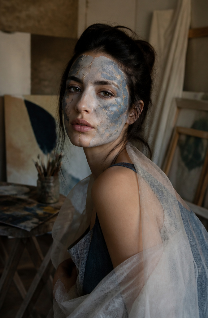
Painting a cracked face or shadowed hollows around your own eyes forces you to sit with the feeling instead of just naming it. Makeup artist Dominique Bossavy built her following this way, using cracked porcelain effects and bruised color to map anxiety and depression onto skin where followers recognized themselves. The designs traveled further than any caption could have carried them.
The work gets sharper when you borrow a color combination or a placement trick from another creator and then twist it toward whatever you are actually feeling that morning. I scroll through finished looks the way I used to flip through someone else’s sketchbook, not to copy the whole page but to note how they handled the hard part. A technique for making a cheek look hollow, a way to set cream liner so it survives twelve hours, a pairing of ochre and slate I would not have risked alone. Those fragments become the raw material for a face that tells your own story, not theirs.
Primary colors mix to every shade you need, so a small kit stays open-ended once you trust the mixing more than the preset palette. The first attempt will look wrong in the mirror. The fifth starts to read as emotion rather than costume.
Color Theory for Makeup
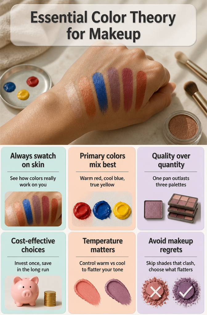
Swatching colors on the back of your hand before touching your face is the single most useful habit I picked up from watching stage makeup tutorials. Skin tone changes everything: a cobalt that reads electric in the pan can turn muddy once it meets your undertone, and you will not know until you see them together. I keep a small mixing palette, but the hand works fine for quick checks, especially when you are deciding whether a lip color will fight or flatter an eye look already in progress.
Primary colors in pigment form, not pre-mixed palettes, are where the money goes farthest. A warm red, a cool blue, and a true yellow let you mix any secondary or tertiary shade you need, and you control the temperature rather than hoping a premixed purple leans the direction your skin wants. The initial cost stings compared to a drugstore quad, but one pan of each primary outlasts three seasonal palettes you stop reaching for once the novelty fades.
Graphic Liner Techniques
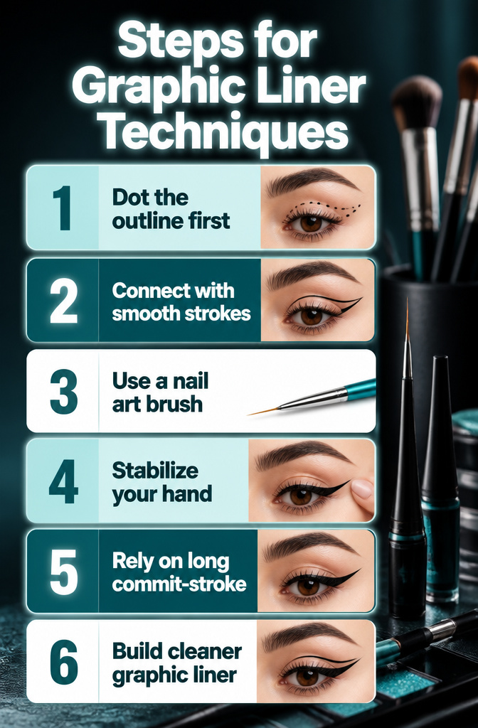
Mapping a graphic liner shape starts with dotting the outline first, then connecting those points in single strokes rather than sketching back and forth. The long commit-stroke keeps the line cleaner because your arm anchors the motion instead of your wrist wobbling through short corrections. I learned this watching tutorials where the finished look seemed impossible until I saw the map underneath: a constellation of tiny dots that turn into wings or floating lines once you join them.
Nail art brushes outperform most detailing eyeshadow brushes for this work. They run thinner, longer, and sturdier, with more size options to match the scale of the shape you’re building. A liner brush meant for polish has exactly the spring and length you need to ride the orbital bone without skipping.
Accessories That Elevate
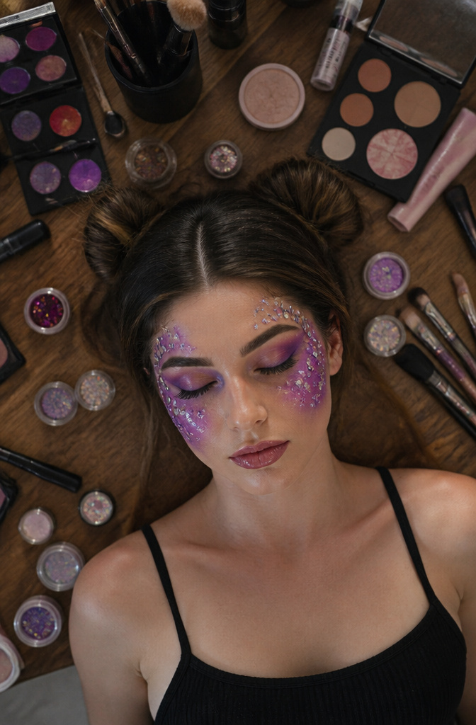
Gems and rhinestones sit differently on skin than powder or cream, so the adhesive choice matters more than the sparkle itself. For a galaxy look, tiny silver studs scattered across the cheekbone read as distant stars; the same stud clustered at the inner corner looks like costume jewelry. I learned that placement rule after seeing a nature look where pearls followed the brow arch like dew drops, each one set with tweezers and lash glue that dries matte, so the focus stayed on the shape, not the glue ridge.
Pearls need a heavier hand. A flat-back pearl will slide off curved skin unless you use a wax-based adhesive or press it into a cream base while it is still tacky. On a pop art face, a single oversized pearl at the center of a drawn flower adds dimension that paint alone cannot reach. The cost runs low, a few dollars for hundreds of mixed sizes, but the time does not. Sorting by dimension before you start keeps the rhythm from looking accidental, and skipping that step is the mistake that turns embellishment into clutter.
Tutorials and Finding Inspiration
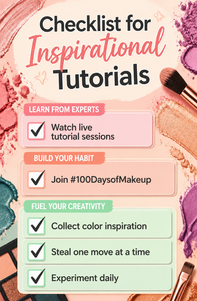
Watching a skilled artist lay down a galaxy eye in real time does something no still image can. You catch the pressure of the brush, the order of layers, the moment they decide when enough glitter is enough. YouTube and Instagram are full of these breakdowns, and the good ones save you hours of guessing why your blend went muddy.
The #100DaysofMakeup challenge turned out to be the structure I actually needed. One creator I followed started it in September 2021 to force herself past soft-glam comfort, and by the end she was modifying techniques freely instead of copying them. A hundred days sounds excessive until you realize the habit forms around day twelve; after that you are just showing up for the next experiment.
Browsing other artists’ work works the same way. I keep a folder of color combinations on my skin tone that I would never have paired myself: teal and rust, violet against warm brown. When I am stuck, I swipe through it before touching a brush. The trick is not to recreate the whole look but to steal one move, one shape, and build from there.
Quality Tools Worth Buying
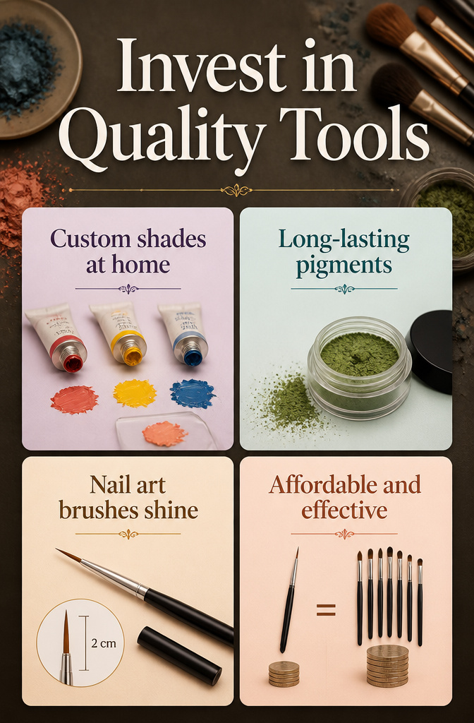
Buying three tubes of red, yellow, and blue pigment from a pro line changed how often I reach for color. Mixing a custom coral or moss green on the back of my hand takes thirty seconds, and the payoff is a shade that actually matches the outfit instead of settling for whatever the brand decided to bottle. Those three tubes outlasted six pre-mixed palettes I bought and forgot about.
The same logic applies to tools. A nail art liner brush with a two-centimeter bristle length and a cap that lets it travel flat beats every standard eyeliner brush I have tried for drawing sharp geometric shapes or tiny starbursts at the temple. The shorter, stiffer fiber pack gives the control that floppy shadow brushes lack, and it costs less than most mid-range eye brushes because the nail market does not inflate prices the same way.