The right eye shadow inspo depends on one thing: whether you have two minutes or twenty, and whether your lids stay put or turn oily by noon. A creamy taupe stick smudged out with a ring finger takes seconds and stays crease-free; a dewy liquid shadow like Armani Beauty’s Rose Ashes demands dry lids and a mirror check by hour three. That same tradeoff runs through every entry here, from matte peach that reads as bare skin to graphic shapes that need primer and patience to hold their edge.
1. Cool Taupe
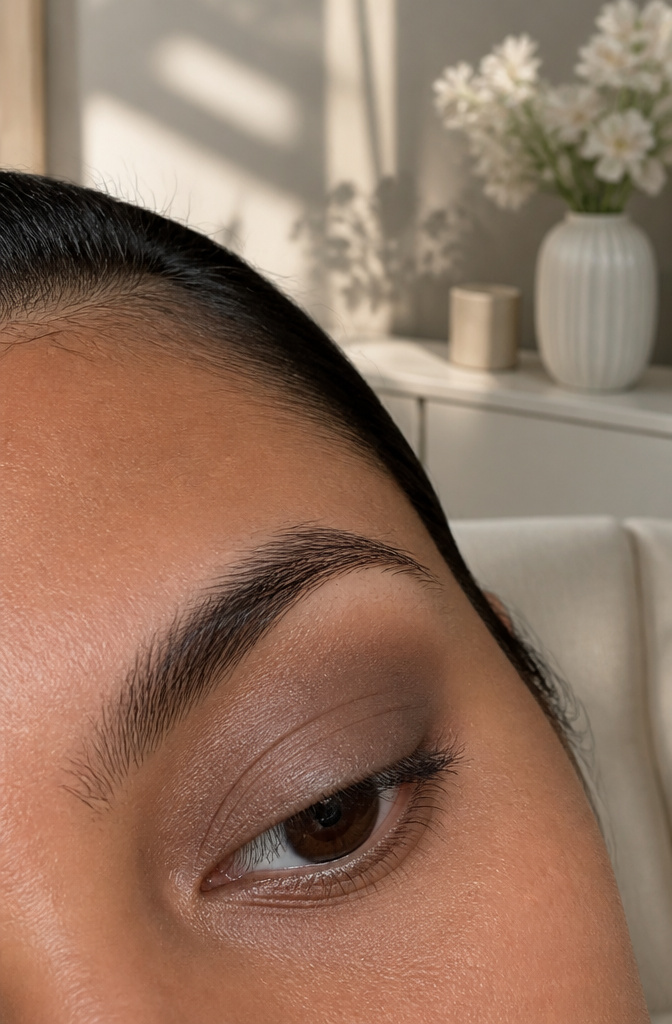
Taupe only looks effortless when it carries enough depth. The shadow should sit at or below your skin tone, never lighter; go pale and the finish turns chalky against the lid, like powder that never quite settles in.
A cool-toned wash of it wakes up the eye without reading as makeup. The slight gray cast gives dimension where warm browns can go flat, and that neutrality makes it the kind of look that works for a 9 AM meeting or a dinner where you did not plan to re-do anything.
It flatters most on medium to deeper skin tones, where the cool undertone creates contrast instead of blending into nothing. Fairer complexions can wear it too, but the match matters more: look for a taupe with enough pigment to register, not a beige calling itself taupe and landing exactly where the chalk warning begins.
Cream sticks make the application nearly automatic. Scribble across the lid, smudge out with a ring finger, done in seconds. The texture does the blending for you, and the color stays where you put it without creasing into that tired line by noon.
2. Peach
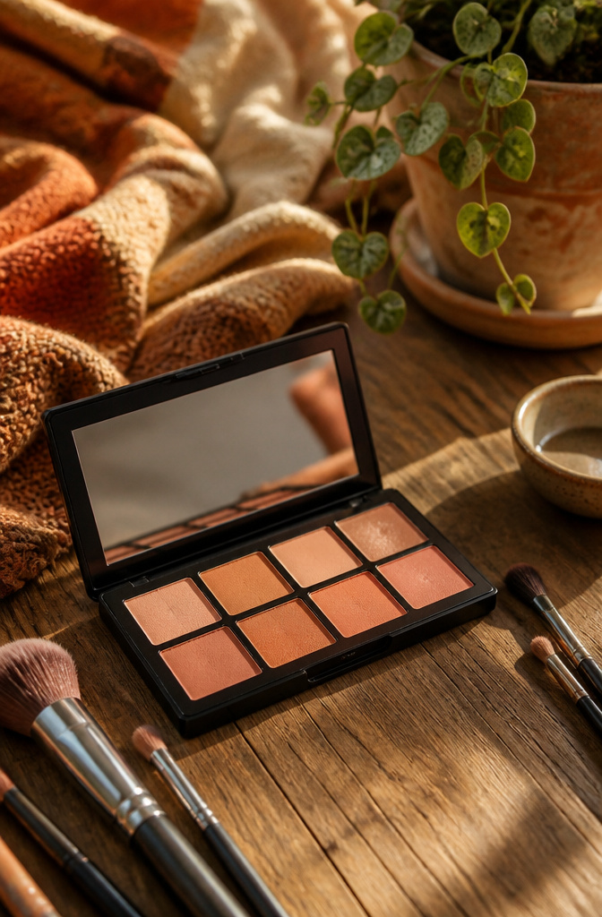
A matte wash of peach across the lid reads as skin rather than decoration, which is why it works for mornings when you want to look finished without looking made up. Keep it matte: powder shadows with no glitter or sheen sit closest to what an unmade eye actually looks like. The warmth in peach pulls forward hazel and green tones, and it softens blue eyes without the contrast that heavier colors create. On warmer undertones it melts in completely; on cooler ones it functions as a subtle color-correcting lift, like a neutral with the gray taken out.
Fenty’s Snap Shadows compact carries three peachy mattes if you want to stay in the family, and one subtle shimmer for evenings when you do want the reflective hit. As a transition color, peach bridges skin to bone or deeper crease shades without the stripe that taupe can leave, and as a standalone lid color it is forgiving enough that blending missteps disappear into the warmth. Haus Labs makes a peach pigment that works eye, cheek and lip if you want the same tone everywhere, though on the lid you’ll want to set it with powder to keep the matte finish intact.
3. Dewy Taupe
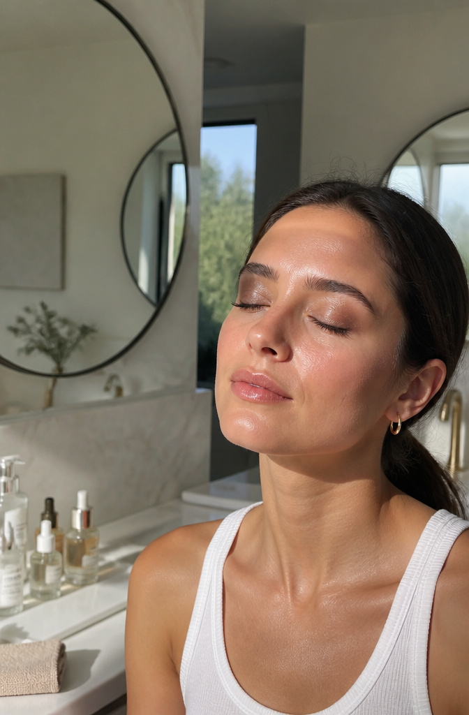
Dewy texture is the move when matte shadow reads as chalky or flat, and Armani Beauty Eye Tint Liquid Eye Shadow in Rose Ashes was built for exactly that problem. The formula stays wet-looking without drying down to a powder finish, so lids keep that subtle, freshly-applied sheen. I pair it with mascara that builds serious length but skips the lower lash line entirely; the contrast keeps the wet effect from sliding into greasy territory.
That "sliding" part matters more than most people admit. On oily lids, this same dewy finish can pool in the crease by hour three, which is why the matte Cool Taupe entry wins for hot afternoons or long events where you cannot check a mirror. Rose Ashes works best on normal-to-dry lids, or on skin that looks dull and needs the reflective quality to bounce light back. IIILiquid Powder Eye Shadow Tint in Burnish offers a middle path if you want shine with a cream-to-powder dry-down, though the metallic finish reads more deliberate than the barely-there wetness Rose Ashes gives.
4. Golden
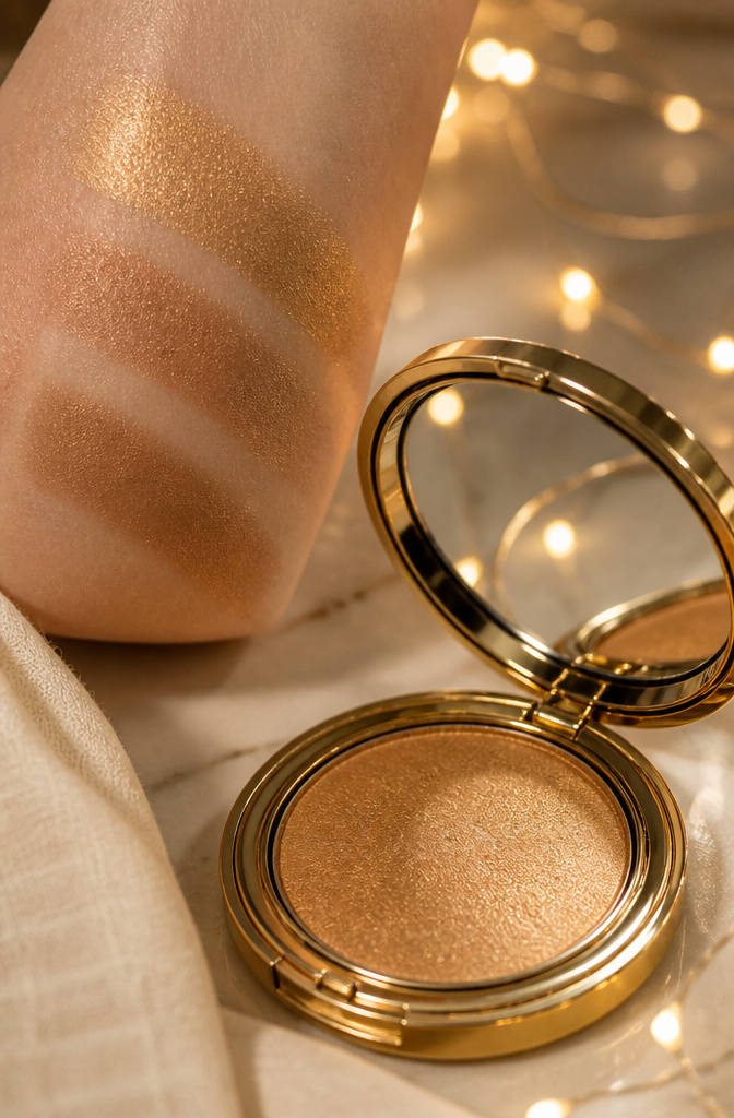
Slight shimmer reads expensive where heavy pigment reads costume. The difference sits in particle size: finer milled shimmer lays flat and catches low light like metal under silk, while chunky glitter travels to the crease the moment you blink and turns into a dull, brassy streak by noon.
Press the shadow on with a flat synthetic brush, do not sweep. Sweeping launches misplaced flakes upward; pressing seats the pigment where you place it. A cream base helps lock it down, and the liquid-cream formulations stay put without gathering in the fold.
The Dior 5 Colors Couture palette builds from a wash to intensity without ever tipping into opaque territory. Its peach corner shade pressed into the inner corner, blended into the deeper browns, gives the effect of candlelight rather than stage light. Charlotte Tilbury’s Eyes to Mesmerize in a liquid-cream base does the same job alone: thin layer, flat brush, press and hold.
5. Soft Pink
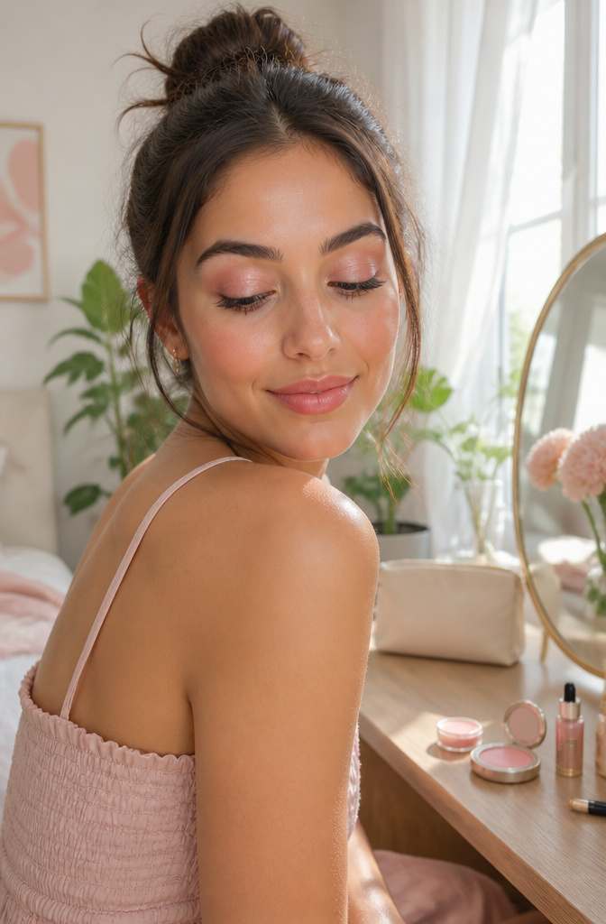
The wrong pink turns eyelids into a visual symptom. Stick to a light baby pink with very subtle shimmer, something sheer enough to read as a lid wash in daylight rather than a block of color. Glossier’s Lidstar in Slip has become my go-to reference for this exact reason: the cream formula carries just enough glitter to catch light without announcing itself, and it blends down to a tint that doesn’t fight natural skin tone. Swipe it across the lid with a finger or a brush, and the effect is an eye that looks open rather than made up.
Where this shade earns its place is versatility. Worked across the entire lid, it replaces concealer-heavy nudes with something softer. Pressed into the inner corner, it performs the same brightening function as pearl or champagne but with warmth that reads younger and less stark. Rare Beauty’s Vulnerable Liquid Eyeshadow operates in the same territory, though the liquid format demands a quicker hand.
The mistake is choosing saturation over sheerness. A bubblegum or fuchsia applied at 7 a.m. becomes a different statement by noon, and not one that pairs with a work blouse. Save those for evening or skip them entirely; the pink that works hardest is the one that barely registers as pink until someone leans in.
6. Tightliner

A creamy shadow or liner pressed directly at the lash line gives definition without the visible stripe of traditional liner. The pigment sits between lashes rather than above them, which is the whole point: thicker-looking roots, no obvious makeup line.
Brush choice matters more than product. An eyeliner brush, the kind with shorter, stiffer bristles, deposits color exactly where it belongs and keeps it from migrating onto the lid. Loose smudging happens after placement, not during.
Powder shadow has a real advantage for anyone whose eyes water easily. Cream pencils and sticks break down faster on a wet surface; a pressed powder, worked in with that stiff brush, tends to hold. The About Face Shadowstick is the exception worth noting, a creamy stick with more hold than usual black shadow and more blendability than standard liner, though for genuinely watery eyes, powder still wins.
The technique layers cleanly under other shadow. A rich color tight against lashes, a transitional shade on the moving lid, lightest beneath the brow: that graduation is what keeps the look from going heavy, which is the mistake that turns people off tightlining before they get the feel for it.
7. Smoke
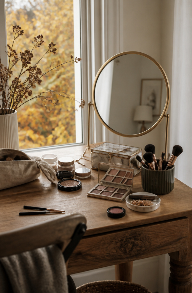
A full smoky eye saturates the lid and drags color deep into the socket, but smoke sits higher and lighter, like a haze rather than a wall. The difference matters most in daylight: smoke reads as definition, not drama.
Gray still owns the name, but matte browns and soft taupes do the same job without the after-hours association. Laura Harrier’s version proved that much — the hollows of the eye carry the color, not the whole lid, and light bounces off the high points exactly where nature planned. Spencer’s rule sticks: follow your own bone structure, not a diagram.
For actual product, the Chanel Les 4 Ombres quad skips black entirely and still hands you a clean, borrowable haze. The Covergirl Trunaked palette goes the opposite way if you want the classic gray underlying a nude base. Two paths, neither wrong, and both lighter work than the full smoky entry coming later in this piece.
8. Gloss
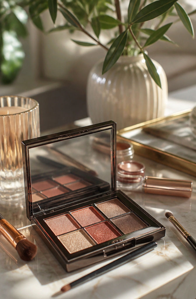
A glossy lid reads editorial in the studio and high-maintenance everywhere else. The real cost is in wear time: anything with true wet-finish tack will migrate into the crease within a couple of hours, especially on hooded or mobile lids.
Clear gloss over powder is the safer play. Spencer’s approach of smudging eye gloss or Vaseline onto a bare or powdered lid keeps dimension without building thick, sliding layers. Danessa Myricks Colorfix in Clear applied to a fingertip first, then dabbed, avoids pooling in the fold. Straight Vaseline works too, and it washes off with any cleanser, but it has zero grip of its own; pair it with a taupe base if you want it to last past lunch.
This texture rewards the patient. Reapplication every few hours is standard, not a failure, so it suits occasions where you have a mirror and a minute, not back-to-back meetings. Worth the maintenance for a dinner where candlelight does the work, less so for a commute-plus-office day.
9. Shimmer
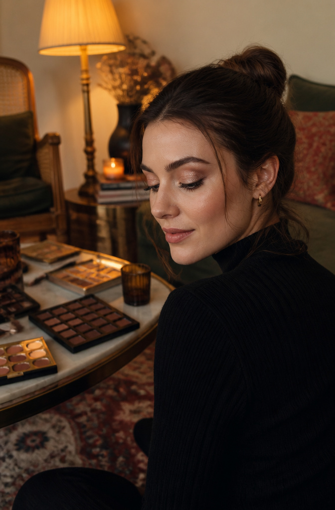
Shimmer reads as a finish, not a color, and that distinction matters for where it lands. On mature lids, shimmer belongs on the mobile lid only, kept away from the crease where it settles into texture and catches light at the wrong angle. A darker matte shade blended through the crease gives the eye structure; the lighter, shimmer-flecked shade pops the center of the lid and makes the eye appear larger from straight on.
Finger application deposits more pigment and grip, which works when you want a concentrated flash on the flat of the lid. A brush diffuses the particles and gives cleaner edges, better for the inner corner or for tapping shimmer over a darker base without dragging it. The mistake is treating the two tools as interchangeable. Fingers push shimmer into fine lines; brushes can dust it where it pools.
Placement rules shift with eye shape. Deep-set eyes pull forward with light, shimmery color on the lid itself, while dark color in the crease only deepens the socket. Prominent eyes do the opposite: matte shadow on the lid from crease down pushes the eye back, where shimmer would bring it outward and amplify what already projects.
10. Classic Cut Crease
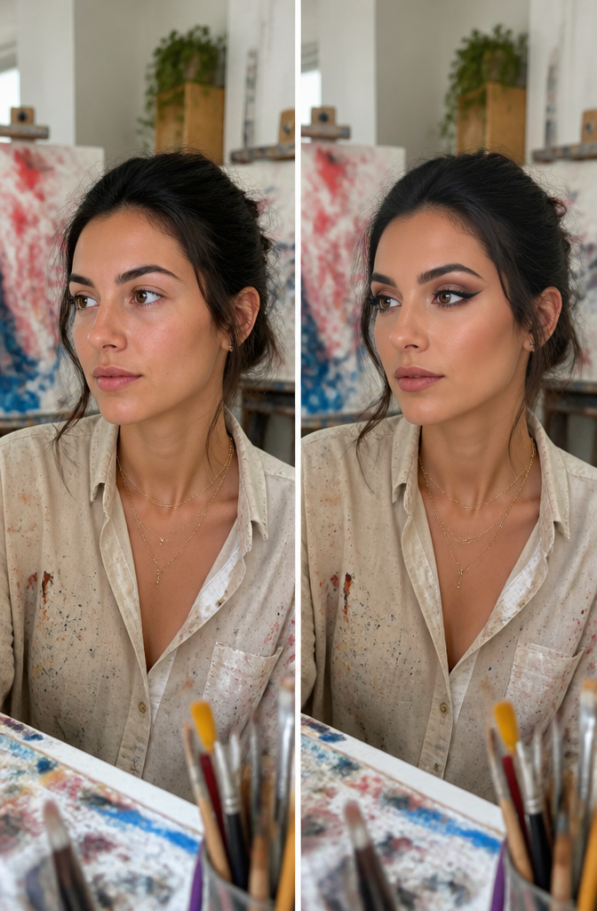
A classic cut crease starts with liner drawn directly into the eye crease, from the inner corner all the way out, then shadow blended above that line rather than up into the brow. The liner carves a new fold where the natural one disappears, so the lid looks bigger and more open once you step back.
Hooded shapes get the most from this structure. The hood itself covers the natural crease, so shadow placed only in the real fold vanishes the moment you open your eyes. Drawing the cut slightly higher, and extending it past the outer corner so it stays visible, creates lid space that was not there before. I have watched this move fall apart when the liner is too wispy to read from a normal distance; the line needs enough pigment to survive the blend.
A primer keeps the work where you put it. Paint Pot in Painterly or Soft Ochre, or NARS Eyeshadow Base, gives the shadow something to grip so the contrast between liner and blend does not muddy by midday.
11. Carved-Out Crease
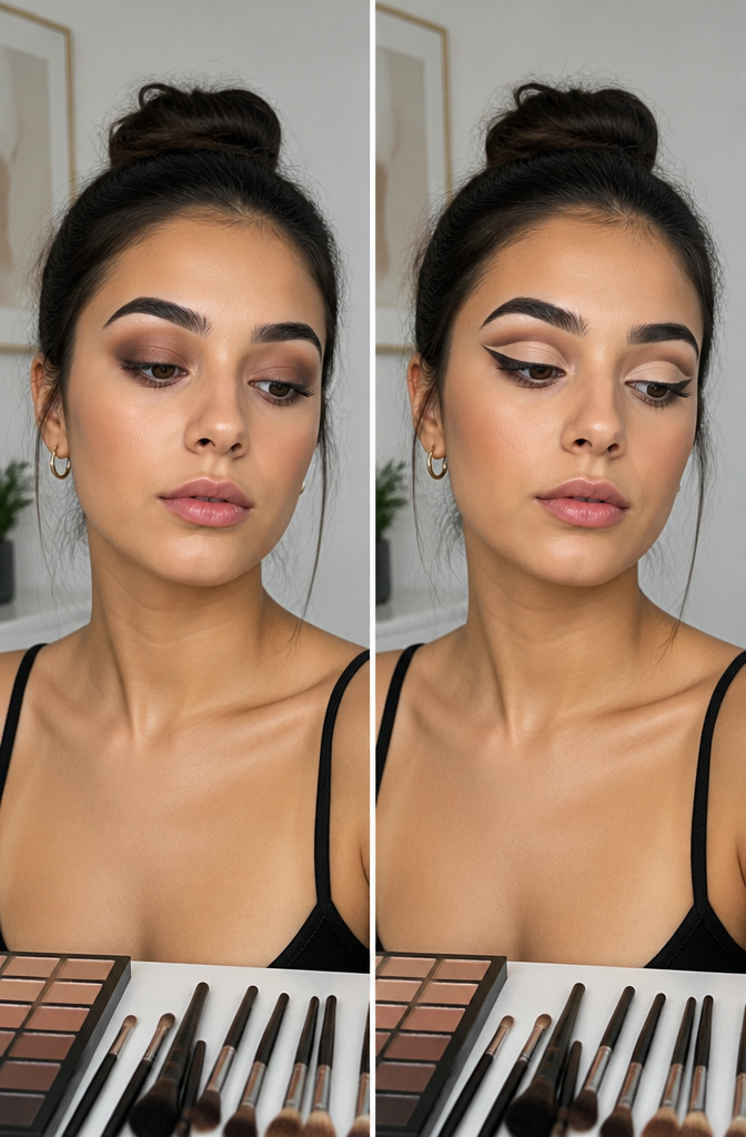
A carved-out crease takes the classic cut crease and sharpens it into something almost architectural. Where a standard cut crease can afford a slightly diffused edge, this version demands a crisp, unblended line with a pale concealer base that reads as blank space against darker shadow. The contrast is the whole point; without it, the shape collapses into a muddy stripe.
Precision matters more than product. I learned this watching tutorials where the crease looked razored in until the presenter turned to blend, and the whole structure softened into ambiguity. The trick is doing the minimum: lay down the concealer with a flat brush, set it immediately with translucent powder, and resist the impulse to feather the edges. Any blending happens below the line or above it, never across it.
The common failure is overworking the product. Cream concealers grab pigment; pat one shadow too many into that wet surface and the pale plane turns into swirled beige. A set base and a single layer of shadow keep the carve clean enough to read from across a room.
12. Smoky Eye
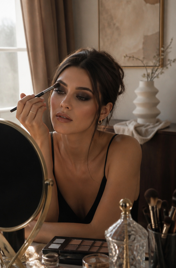
A smoky eye only sounds like one thing, but the technique works with any color you already own. The shape matters more than the shade. Darkest pigment sits right at the lash line, then fades to nothing before it hits the brow bone. That gradient is what makes the look read as smoky rather than just dark.
Blending matters more than the pigment you pick. A single shadow shade can do the job if you spend the time feathering the edge until it looks almost blown on, like velvet-soft pigment that arrived by accident. Charcoal or black gives the classic sultry evening effect, but a deep burgundy or forest green follows the same rule and reads far less expected at a 7 p.m. dinner.
For round eyes, the smoky placement changes the story. Keeping the darkness heaviest on the outer half and pulling it past the lid’s natural end creates length where the eye wants to read as circular. The color recedes exactly where you want it to, and the blend does the rest.
13. Winged Shadow
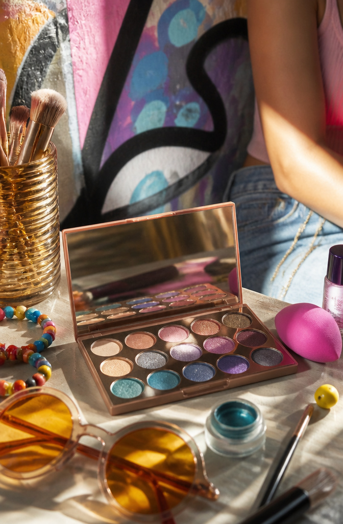
An angled brush and a dark shadow can draw a wing that lifts the eye without the surgical precision liquid liner demands. The softer edge reads as shape rather than line, which matters if your lid folds over the crease or the outer corner turns down. For hooded eyes, the shadow has to sit in the crease and above it, carried past the corner far enough to stay visible when the eye opens. Downturned eyes need that same upward sweep, with the dark shade pulled along the lower lash line to complete the lift. Concealer applied beneath the wing with a clean brush sharpens the angle after the fact, so you get the cat-eye effect without the tremor of drawing it freehand.
14. Waterlined Effect
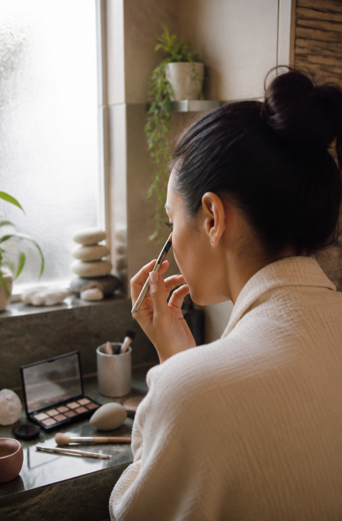
Wetting shadow before it touches the waterline changes the game entirely. A damp brush pressed into a matte or satin formula turns pigment into a soft paste that grips the mucosal skin, giving you a line that outlasts any pencil by hours without the waxy migration that ends up in your crease by noon. Cream-to-powder and baked formulas hold up best damp; standard dry pressed shadows often harden into a stiff cake that flakes off with every blink.
The comfort tradeoff is real. Wet application deposits more pigment, so the intensity you get is closer to a liquid liner, but the moisture can feel briefly cool and slightly tight as it sets. I find letting the brush dampen, not soak, keeps the balance: dip in water, then swipe the shadow surface once or twice. The line stays where you put it, and your eyes do not feel like you have sealed them shut.
15. Fairy Eyes
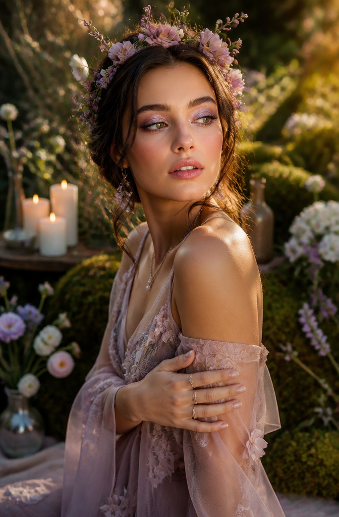
Iridescent shadow can read as costume fast, which is why the placement matters more than the pigment. The sources that rank for this look start with a matte, taupe-y base swept up to the brow bone; that flat finish gives the light-catching stuff something to push against so it pops instead of pooling.
The color shift itself comes from duochrome or interference pigments, the ones that flip between two tones depending on the angle. Used wet along the center of the lid and inner corner, they catch light the way actual fairy wings might, but keep the crease and outer V in that same matte taupe and the look stays grounded. Mascara adds the necessary contrast so the eye doesn’t dissolve into shimmer.
For festival or just a Tuesday that needs some fantasy, the balance is the whole trick: one strategic swipe of iridescence, surrounded by enough matte to make it read as intentional rather than accidental.
16. Smudged Shadow
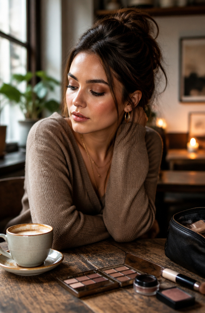
The smudged shadow look lives somewhere between a clean line and a full-blown smoky eye, and the difference matters. Where Smoke builds layers of blended pigment upward and outward, smudged shadow keeps everything low and loose. I start with a soft pencil or a flat, dense brush rather than anything fluffy; the goal is a controlled blur that stays at the lash line, not a gradient that climbs toward the brow.
The deliberate messiness is what saves this from looking like you applied liner at 7 a.m. and forgot to check a mirror by noon. You want the blur to read as softness, not accident. A cream shadow stick wins here over powder because it breaks down with a fingertip or a small smudger brush in exactly the way you choose, not in the way humidity chooses for you.
The limit is the lash line itself. Go past it and the look tips from French-girl undone into slept-in. I keep a pointed cotton swab dipped in micellar water near my elbow for cleanup, but I use it sparingly. One too many passes and the entire effect disappears. Powder shadow layered over the cream sets the blur without sharpening it, which is the whole point.
17. Everyday Eyes

Bronze reads as shadow on most skin tones without reading as orange, which is why it lands in more requests for "neutral eye shadow inspo" than brown or beige. The whole lid in one sweep takes under two minutes and still looks finished because the warmth catches light at the lash line and the brow bone differently, so the eye has dimension even without a second shade.
A flat shader brush, the kind with dense, short bristles, deposits enough pigment in one pass that you do not need to layer. The same brush shape works for pressing color onto the lid or for softening it along the lower lash line if you want a little definition there. Smoke the edge with a clean finger while the pigment is still soft if the line looks too sharp against bare skin; that fifteen-second step saves the look from reading like you stopped halfway.
Nude eyeliner on the upper waterline, something the right sources keep returning to, keeps the bronze from drifting too warm against the whites of the eyes. The finished effect is muted shine, not shimmer, and it pairs with whatever else you are wearing without fighting for attention.
18. Graphic Eyes
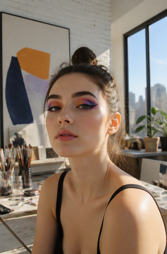
Bold eye shadow works best when geometry, not anatomy, calls the shots. The classic cut crease starts with eyeliner traced along the natural crease, from inner corner to outer corner, which creates a hard graphic line that shadow then fills. Hooded eyes shift the shape upward, but the principle stays: abandon the contour and draw the shape you want instead.
Tape or stencils keep the edges clean. A straight piece of tape angled from the lower lash line toward the temple gives you a sharp winged boundary; peel it off after pigment sets and the line stays crisp. For a full graphic lid, small stencils in angular or almond cuts let you lay down opaque color without the wobble that freehand always risks.
Reserve this for occasions where someone asked you to bring the look, not where you’re showing up to blend in. A small colorful wing with translucent shadow across the lid and sparkle at the inner corner can read editorial at a party or a gallery opening. That same look at a 9 a.m. stand-up, or with full neon geometry across the whole socket, starts to look like costume. Primer matters here more than with natural shadow: the MAC Paint Pot in Painterly or Soft Ochre, or the NARS Eyeshadow Base, keeps the edges from breaking down early, since a blurred graphic line is just messy, not bold.
19. Matte Shadow
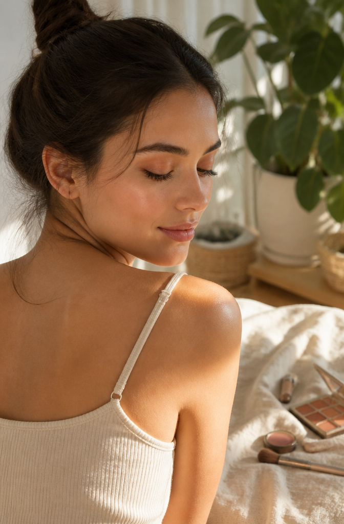
A wash of peachy matte shadow reads as skin tone rather than makeup, which is exactly why it works for the no-makeup makeup look. Powder formulas with no glitter or sheen sit closest to a natural lid, and the peach keeps things from going flat or ashy in a way that taupe or brown sometimes can. Spencer’s point that matte reads most natural holds up in practice: the color becomes texture, not decoration.
The forgiving part matters too. Matte blends without fighting you the way shimmer can, so the edge disappears even if your application isn’t precise. Fenty’s Snap Shadows palette builds this out with three peachy mattes that layer from barely-there to something more intentional for evening. Haus Labs makes a three-in-one pigment paint in the same family if you want one product to carry across eyes, cheeks, and lip.
The difference from a dedicated peach entry is finish intent. Peach as a color story might lean satin or build toward glow; matte shadow stays deliberately quiet, using the shade to correct tone rather than to warm. You skip liner, keep mascara minimal, and let the lid look like a slightly better version of itself.
Eye Shapes and How Shadow Sits
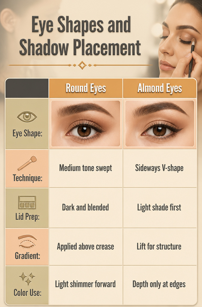
Round eyes look wider than they are long, so shadow placement needs to stretch them sideways. I sweep a medium tone across the lid, then blend a deeper shade from the outer corner toward the temple; the extra width fakes an almond silhouette without looking like a thrown-on smudge.
Almond-shaped eyes already have that horizontal stretch, which makes them forgiving. A sideways V-shape at the outer corners, dark shadow pressed into the lash line and angled slightly upward, gives definition without closing the eye. I lay down a light shade across the whole lid first so the darker pigment has something to grip and the edges stay soft.
Hooded lids hide the crease when the eye is open, so any gradient gets swallowed. The fix is working above the natural fold; I place the transition shade with the brow raised, where the shadow will actually show once the face relaxes. Monolids call for a similar lift, building pigment in horizontal bands that read as structure rather than relying on a crease line that is not there. Deep-set eyes sit back in the socket, and dark colors in that recess only push them further inward. A lighter, shimmery shadow on the lid catches what light there is and brings the eye forward; I keep depth to the outer edge only, never the hollow itself.
Frequently Asked Questions
What are some easy eyeshadow looks?
Classic cut crease, smoky eye, and everyday eyes rank among the simplest. A cut crease starts with liner drawn into the crease from inner to outer corner, then shadow blended above; everyday eyes need only one bronze sweep across the lid with a flat shader brush, smoked at the edge with a finger while the pigment stays soft. Both take under two minutes once you know the motion.
How do I apply eyeshadow for my eye shape?
Round eyes gain length when darkness stays heaviest on the outer half and pulls past the lid’s natural end. Hooded shapes need shadow carried into the crease and above it, since a fold that vanishes when open will swallow anything placed only in the natural fold. Almond eyes suit a sideways V of dark shadow at the outer corners, laid over a light base swept across the whole lid.
What colors should I use for my eyeshadow?
Choose by what you want to correct or enhance, not by trend alone. Cool taupe wakes the eye without reading as makeup on medium to deeper skin; peach pulls forward hazel and green tones and softens blue eyes without harsh contrast; bronze catches light at the lash line and brow bone differently, so the eye keeps dimension even in a single shade. Match the undertone to your own, and keep saturation low for daylight.